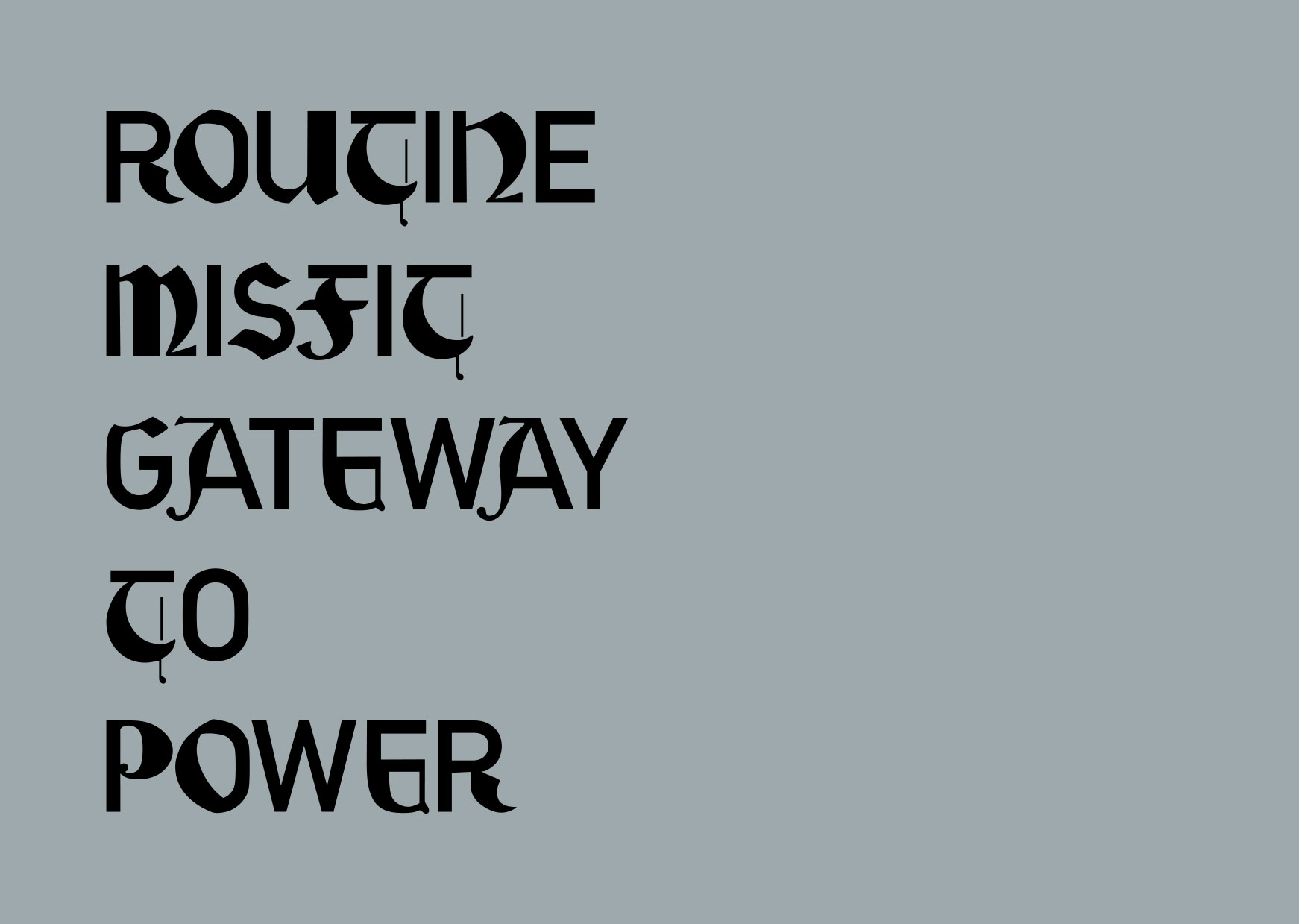
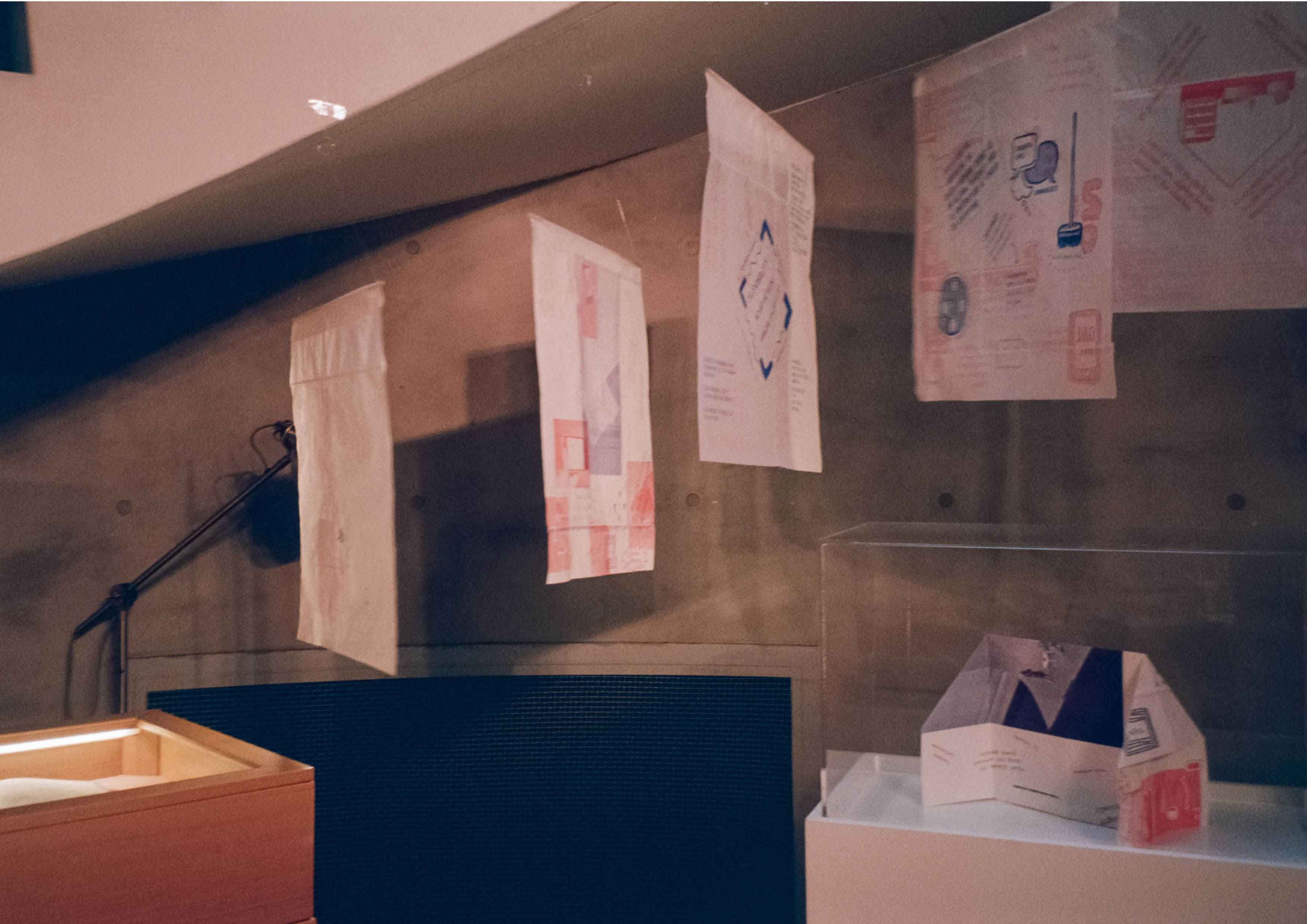
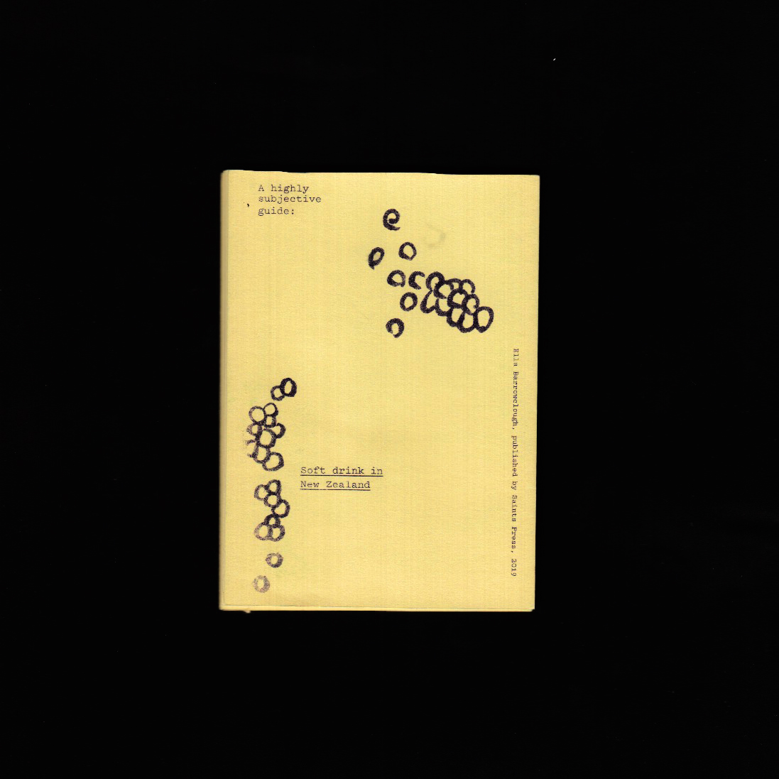
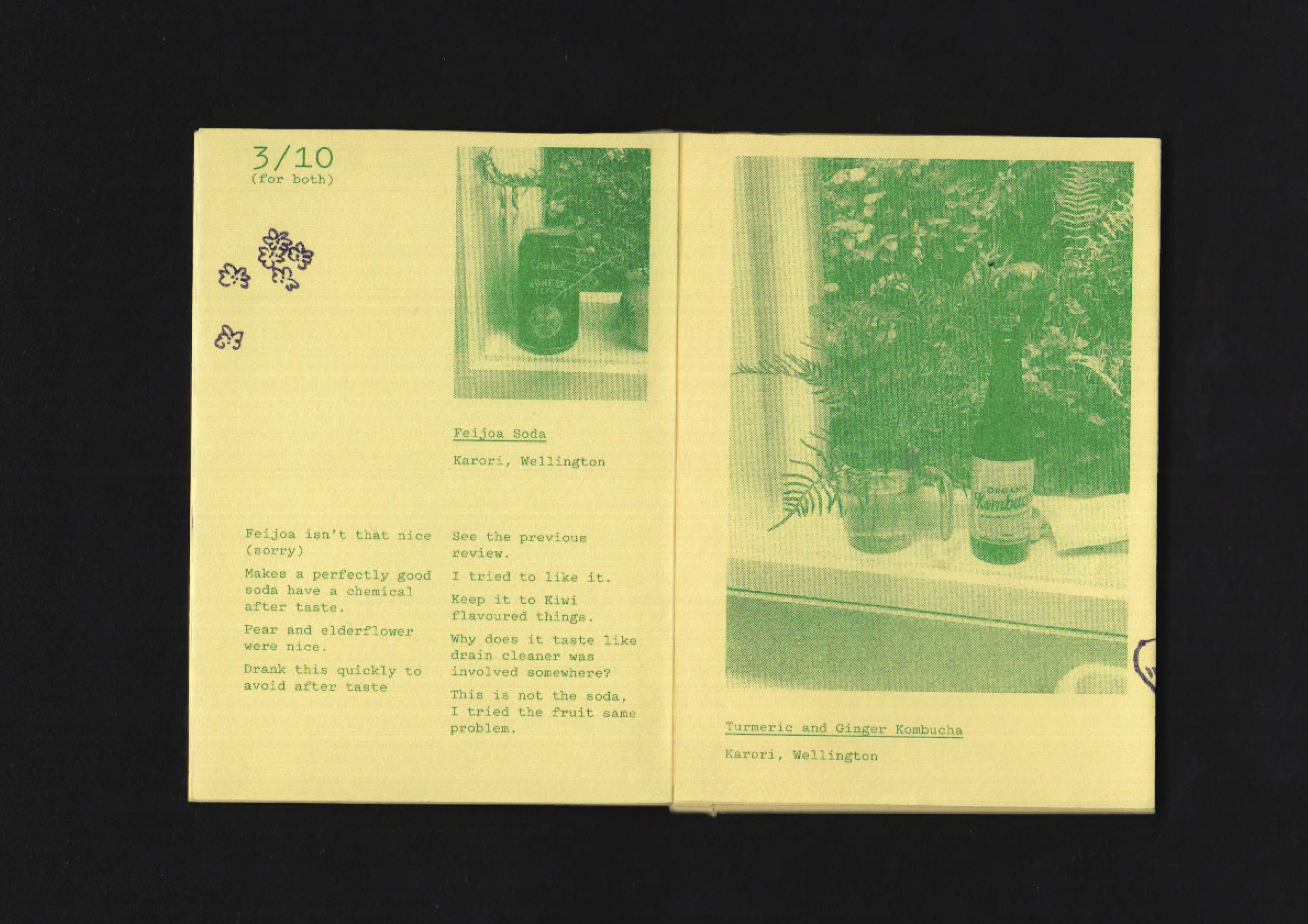
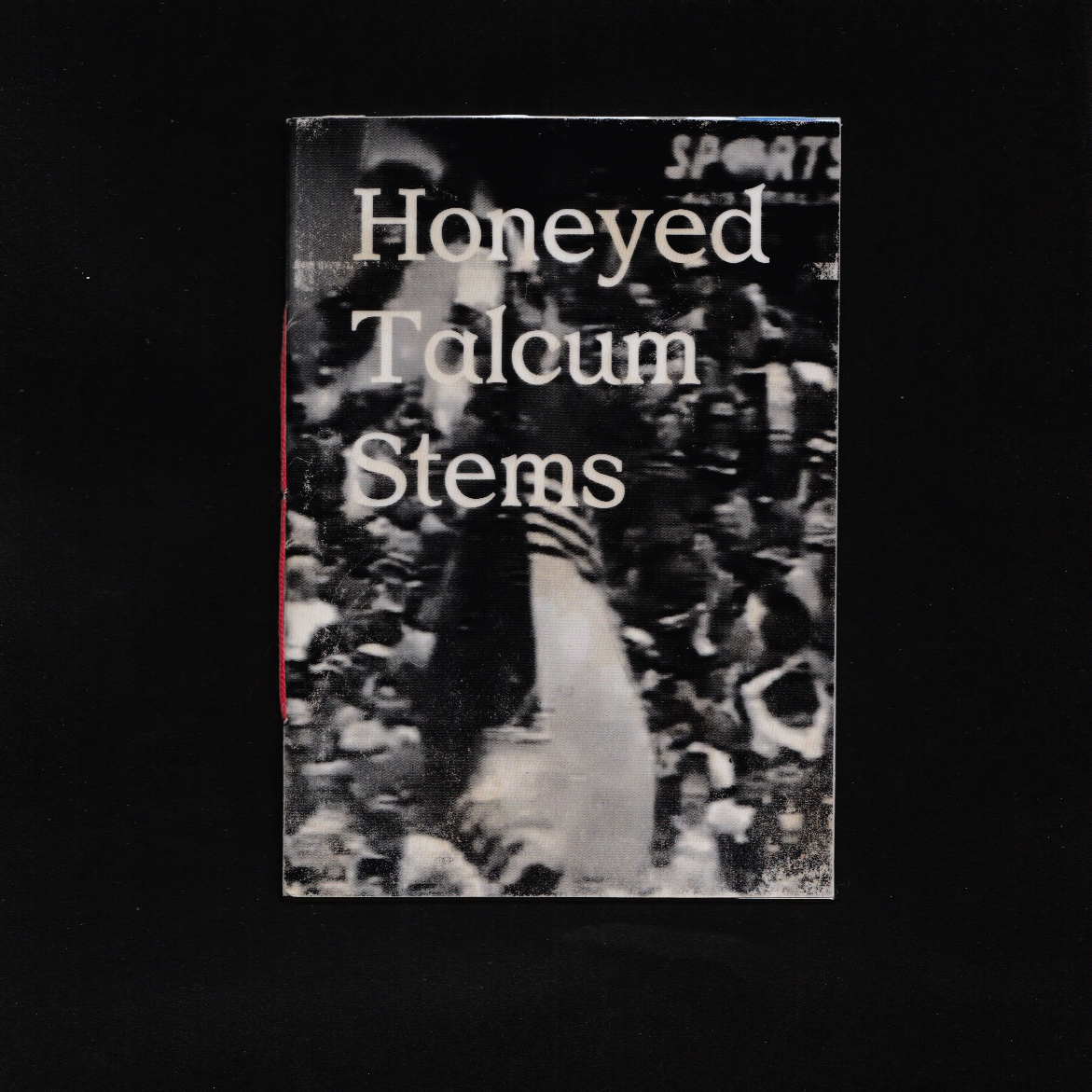
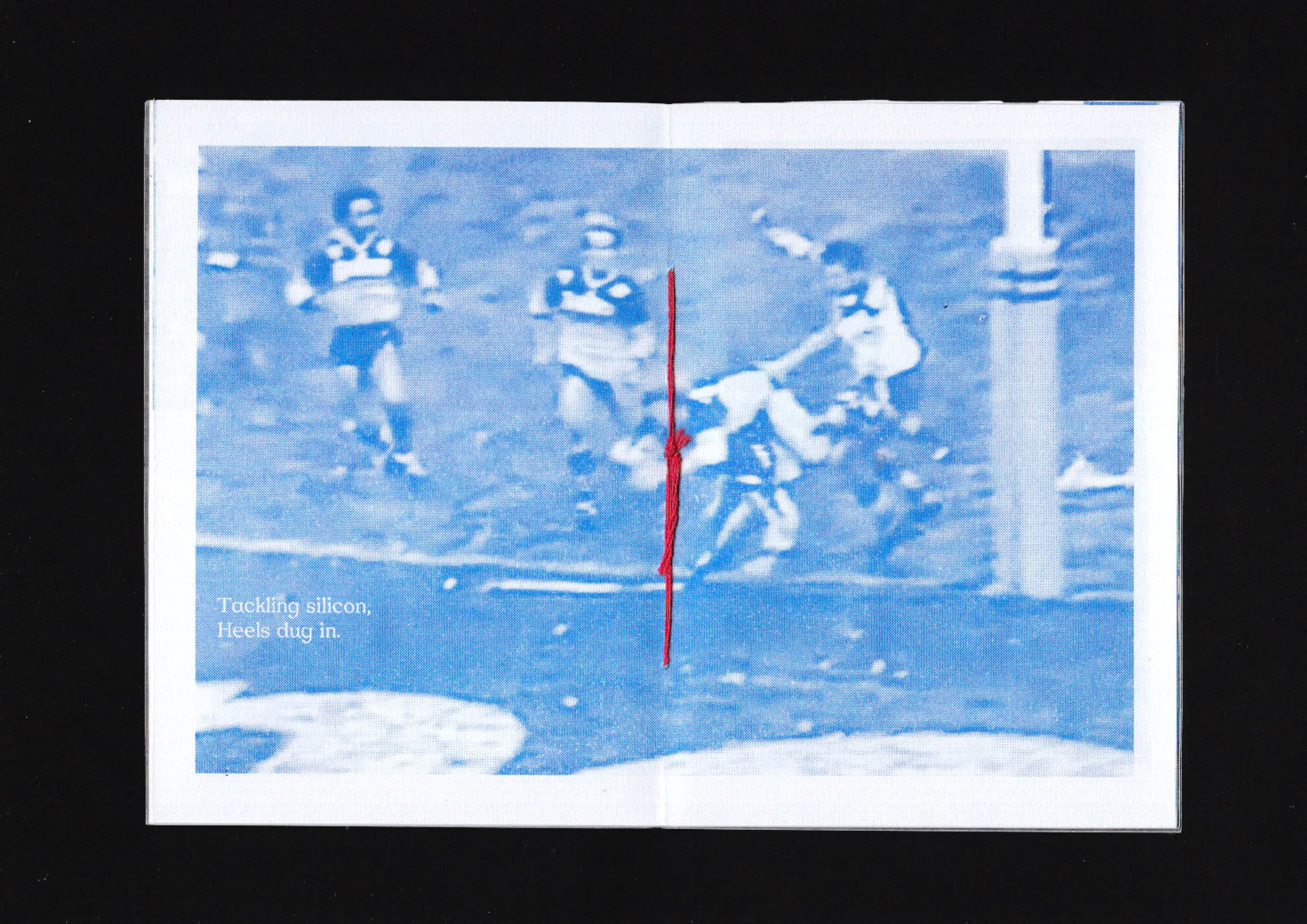
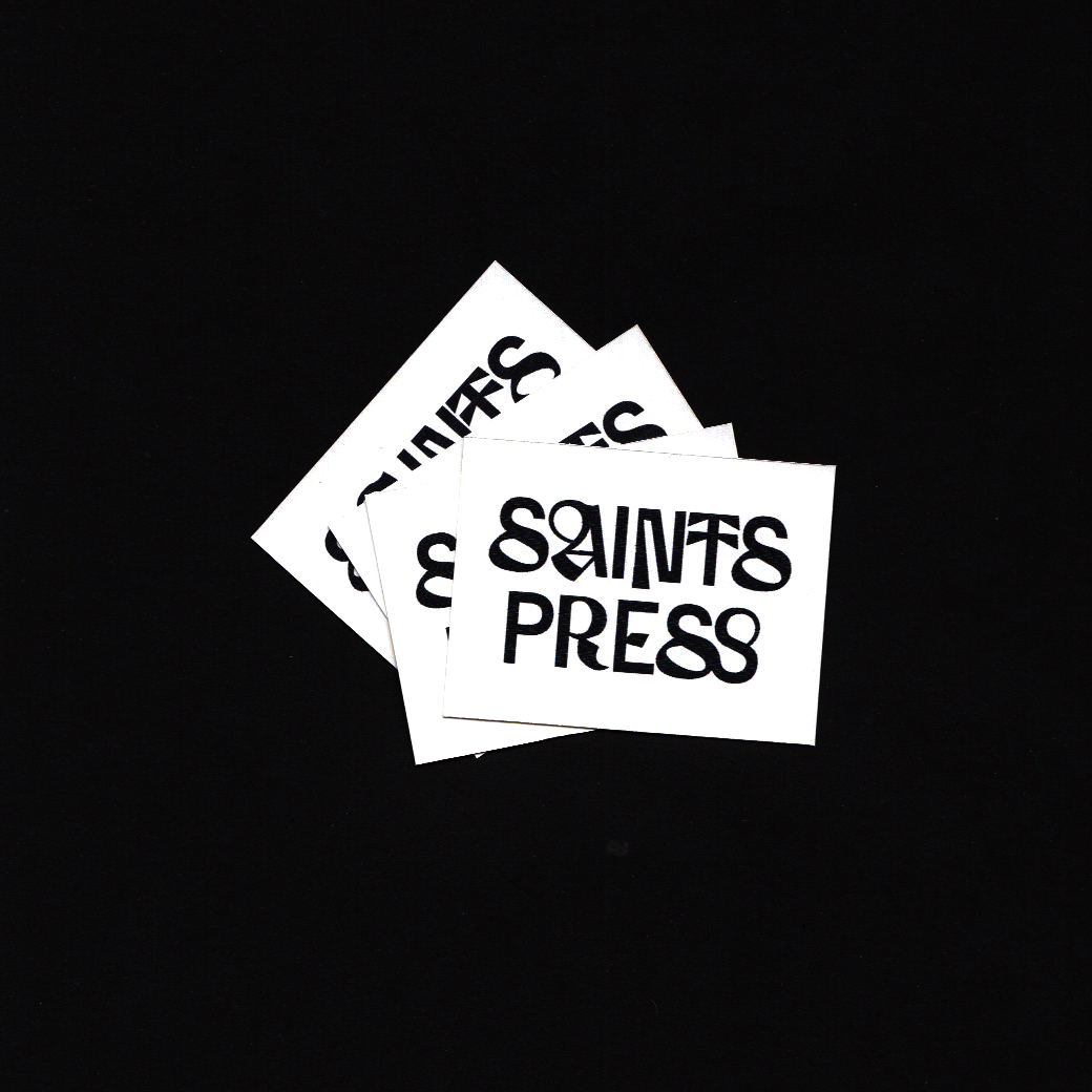
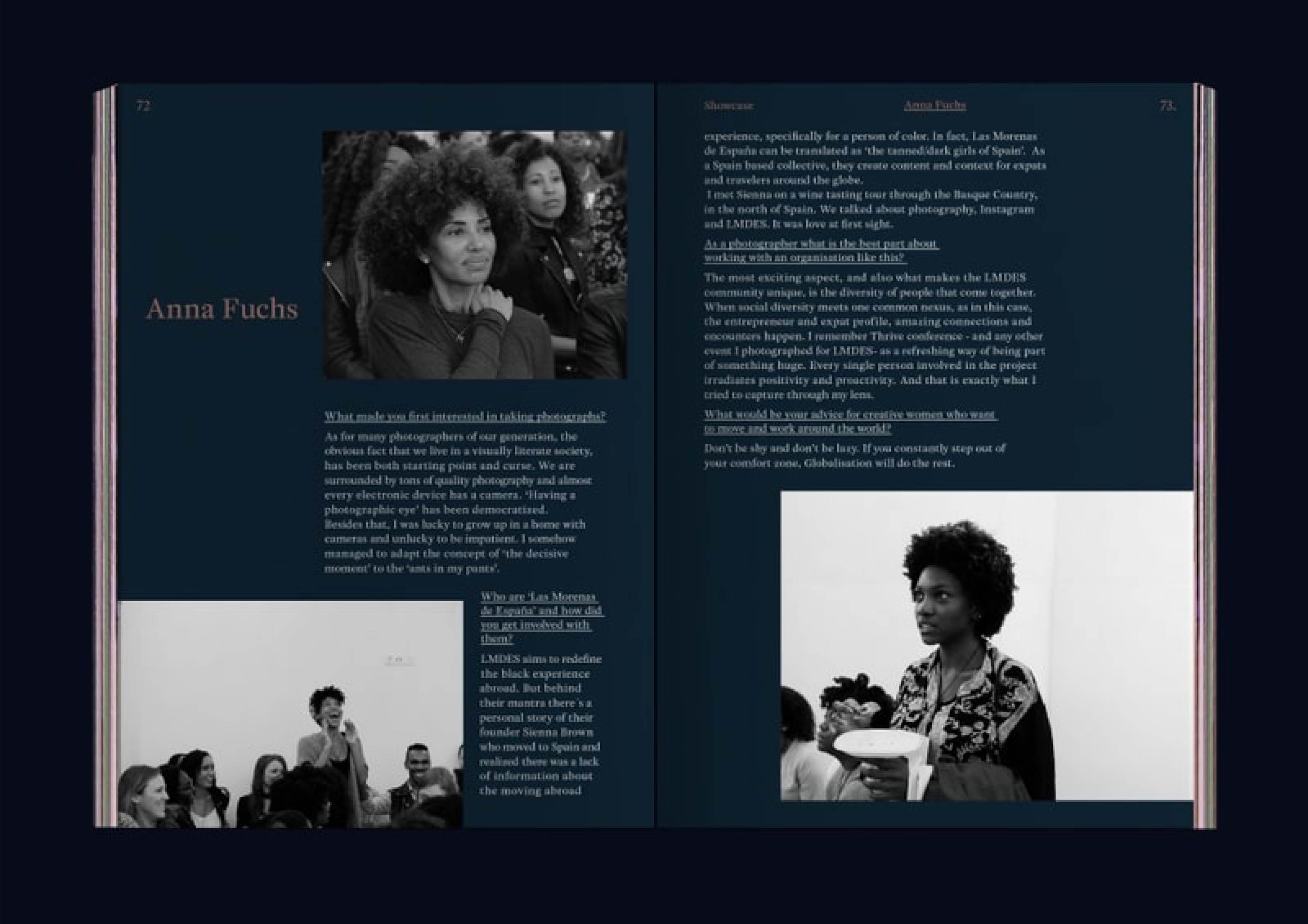
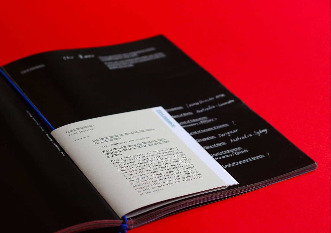
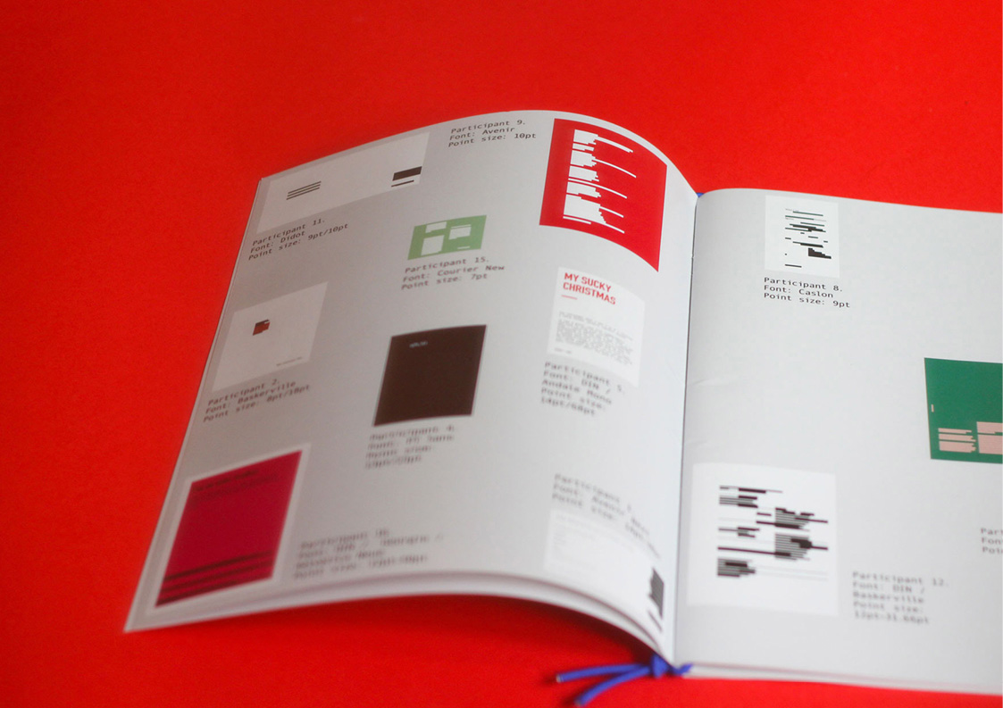
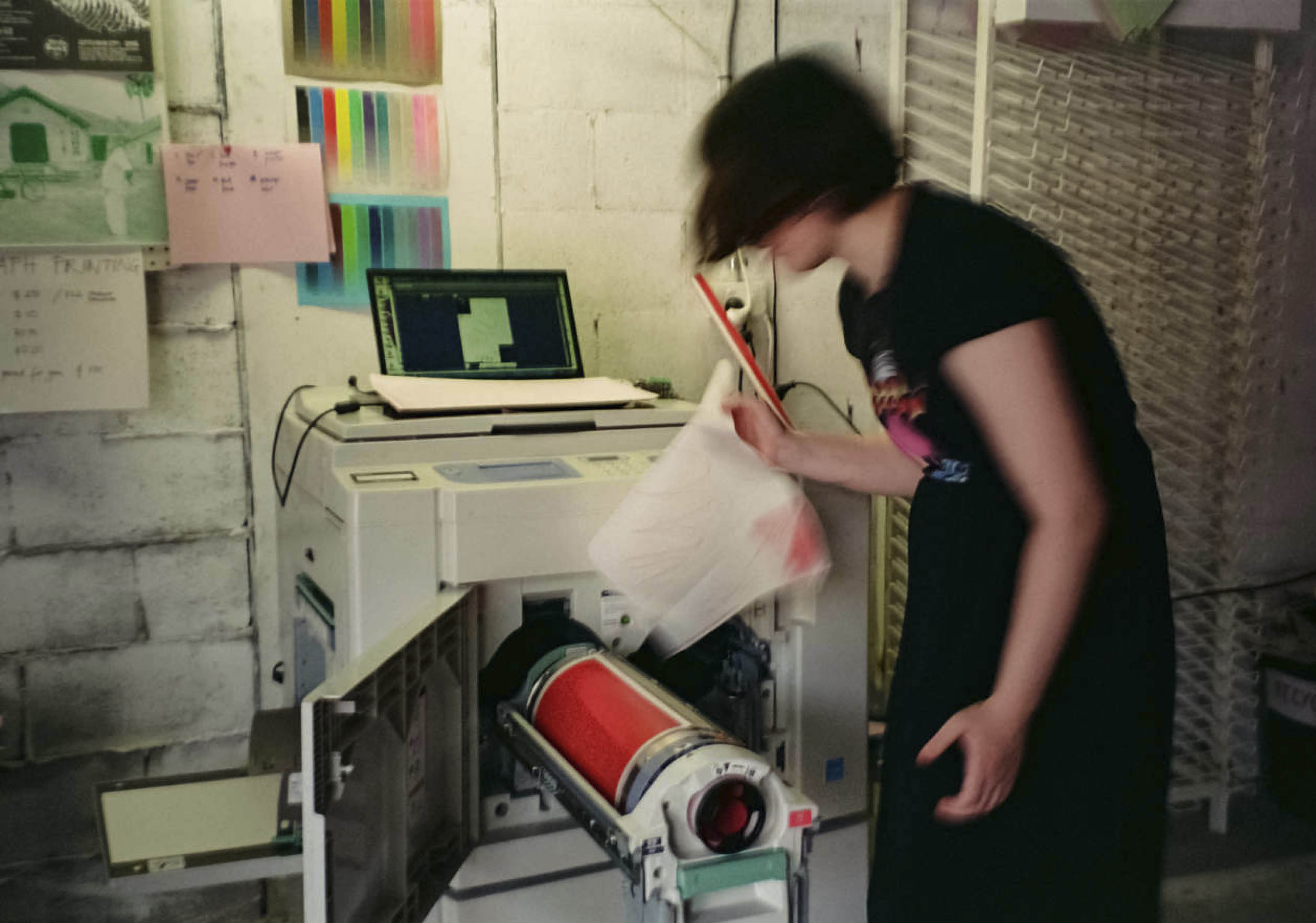
| 2015-: Saints Press Saints Press Saints Press is an ongoing interdisciplinary, collaborative, and Queer bent publishing Project and press. Run by Ella Cutler and Kristelle De Freitas, we hope to invite publishing projects that seek to collaborate with both human and non-humans to see where it goes. Originally beginning with a GR1750 risograph (RIP) bought from a convent’s printing press. We now print on another Risograph and other printers. You can read our zines on our instagram: @saints_press Shown here are: Honeyed Talcum Stems by Ella Cutler and Jacob Dawson-Daley NZ Soda reviews by Ella Cutler Three Women Bound by Rebecca Hall and Ella Cutler Ishmerai by Ella Cutler and Jacob Dawson-Daley Heavy Air by Jacob Dawson-Daley and Ella Cutler Pauses by Tim Busuttil and Ella Cutler Lunar New Year by Madeleine Er and Ella Cutler Untitled by Isabella Sanasi Floating Heads, Heavy Bodies by Ebony Goh and Jaymee Kim Apple HDD Hts5450a7e36 by Ella Cutler and Jacob Dawson-Daley | 2016: That Certain Feeling First Instance / That ‘Certain’ Feeling First Instance: and as a result That ‘Certain’ Feeling are empathetic research systems and provocation to allow a critical dialogue to take place, surrounding the way privilege manifests in visual communication practice. The manifestation of this system and research is the modular and multi-faceted publication: That ‘Certain’ Feeling. Both First Instance: and That ‘Certain’ Feeling seek only to suggest and open up a platform for discussion around how we, as visual communication designers, can navigate the complex and nuanced network of factors that might contribute towards the perpetuation of privilege in our practice. This system is not meant to cause anger or frustration, but rather guide us to make more conscious decisions within our practice. Shown below are a typographic experiment looking at accessible type size, type below recommended accessible size and level of contrast have been redacted. These layouts were designed by workshop participants as part of this project. | ||||||||||||||||||||||||||||||
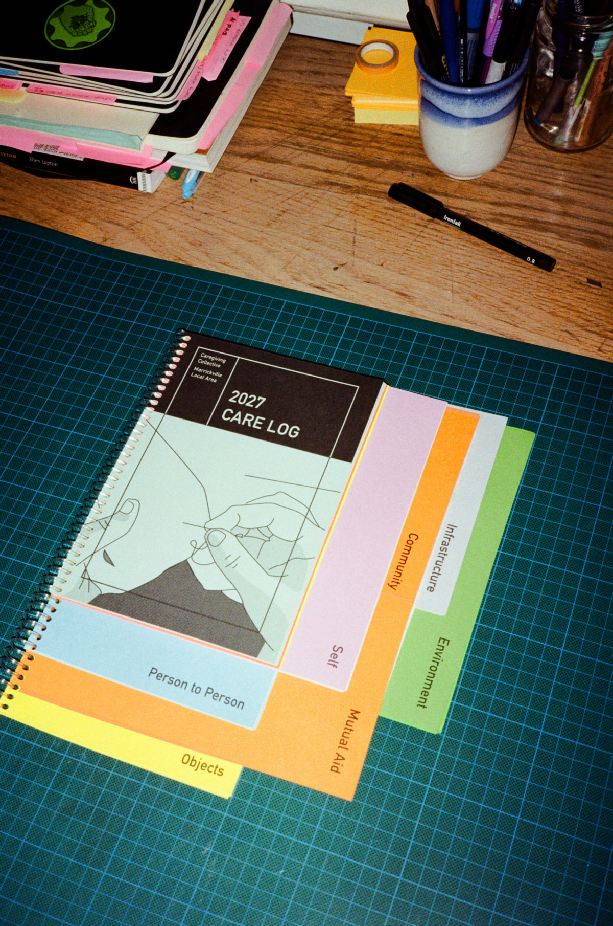
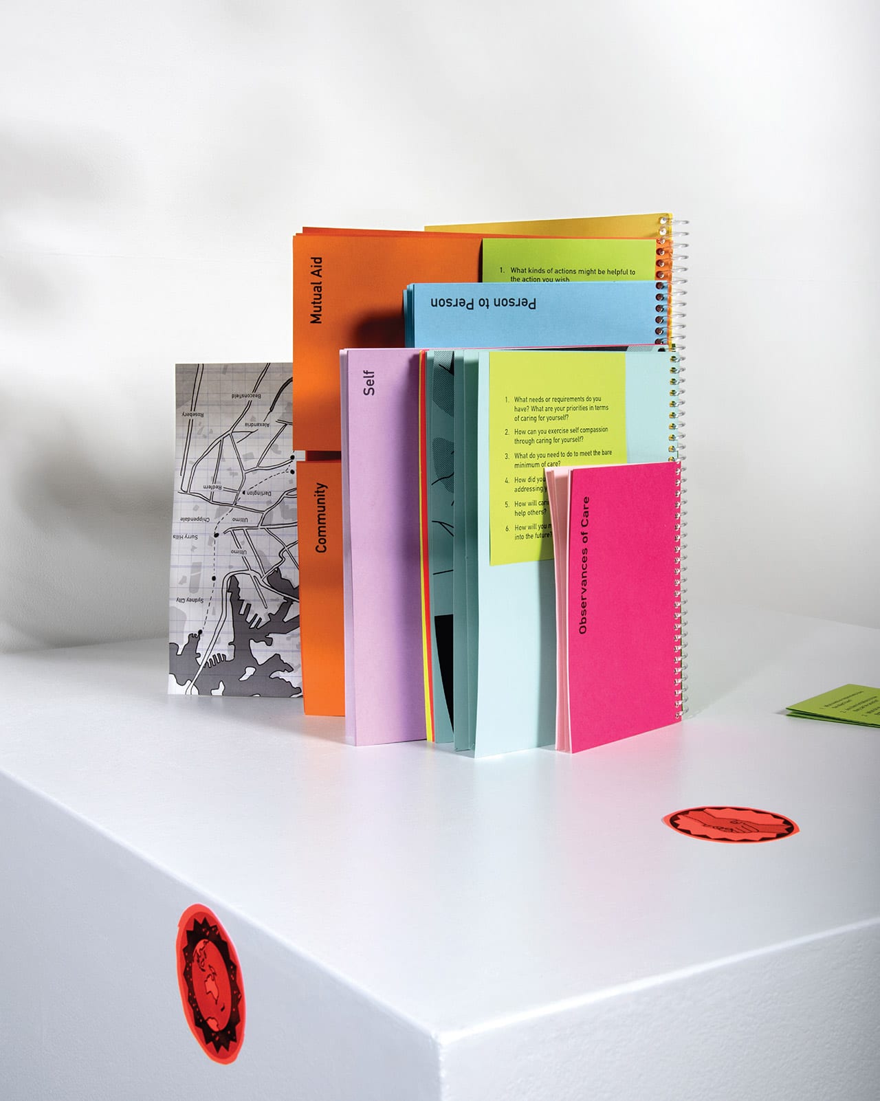
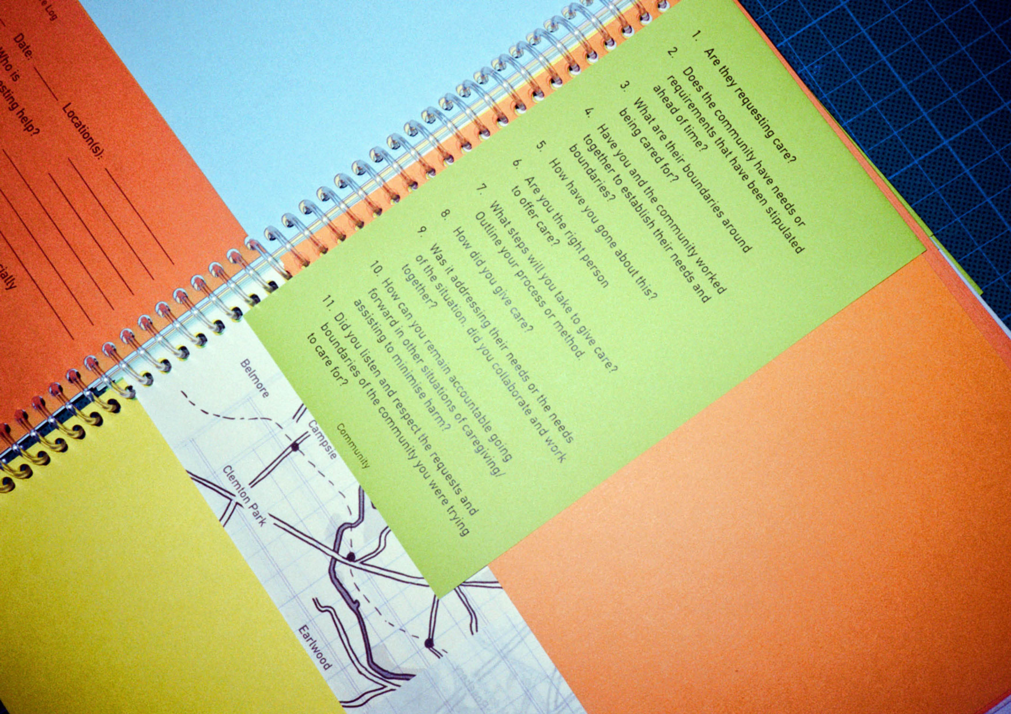
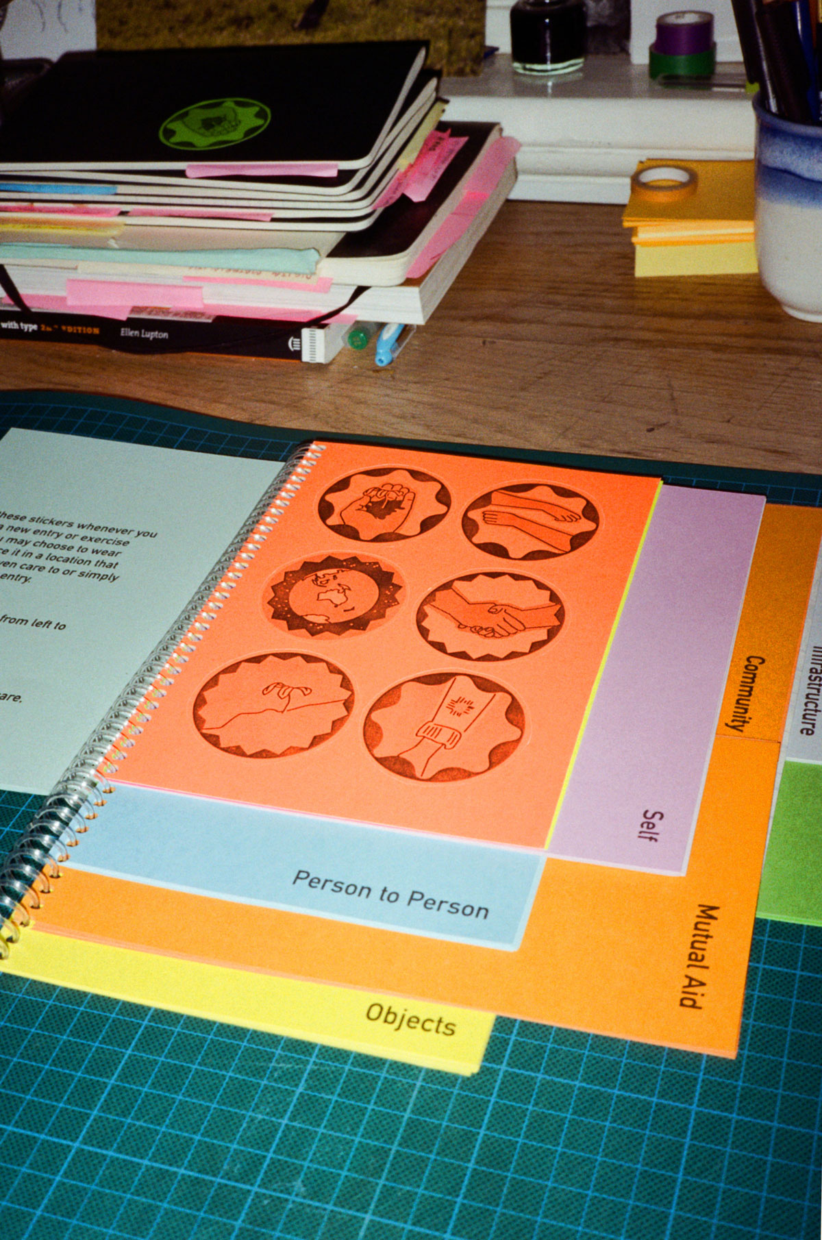
| 2027: Care Log Item 20272002: 2027 Care Log, published by Marrickville Local Area Caregiving Collective The 2027 Care Log aids to thoughtfully document our relationship and thinking around care moving towards 2029. How do we transition to a society that cares deeply and intricately about the world and communities we inhabit? In 2027 the Care Strike began this transition. Drawing on Care Work: Dreaming Disability Justice by Leah Lakshmi Piepzna-Samarasinha, the log examines how we can interrogate the ways we care for others, communities, objects and places. Acknowledging the long history of BIPOC, Disabled and LGBTQI+ communities creating and maintaining care spaces as well as designing tools for giving and receiving care that are widely borrowed and used without credit today. Drawing on the form of the NSW RMS Learner Driver log book, the log asks us to document the many ways we might care for others, communities, objects and our own world; recognising that they all require different forms of care. The log looks at trying to interrogate the way we give care by being critical of the ways it might be given. Acknowledging that at the same time care has had a violent past that has continued right up until the present especially for First Nations and Black communities. It will be an imperfect transition, but it’s a start. Project designed for The Things We Made Next as part of 2021 Melbourne Design Week alongside designers: Alison Page, Tessa Zettel, Damien Wright and Su San Cohn. Curated by Elliat Rich, David Pledger & Alex Kelly. Produced by Sophia Marinos. Photos by Kristelle De Freitas, Elliat Rich and Dr Alexandra Crosby | |||||||||||||||||||||||||||||||
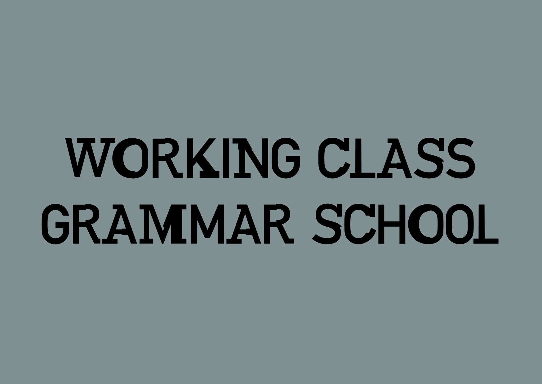
| 2020: Queer Tour of UTS Queer Tour of UTS Custom mutant font(s) for artist Sarah Rodigari’s Queer Tour of UTS, designed using UTS’s old font: DIN in combination with other fonts evoking meaning and visual affordances of each idea. ‘Queer Tour is an event series in collaboration with the UTS Queer Collective. Research was undertaken with UTS academics in the fields of science, architecture, UX design, and gender studies. The tours drew a portrait of the university, intimately illustrated by its staff and students, their knowledge and lived experience. The poster series was designed using ideas that arose during the creative process around queer spaces, architectures, voices and the queering of public space and what this might look and feel like within an institution. The typographic treatment developed for the posters queers the font used by UTS. This further considers the paradoxical relationship of a queer tour in an institutional context.’ | |||||||||||||||||||||||||||||||
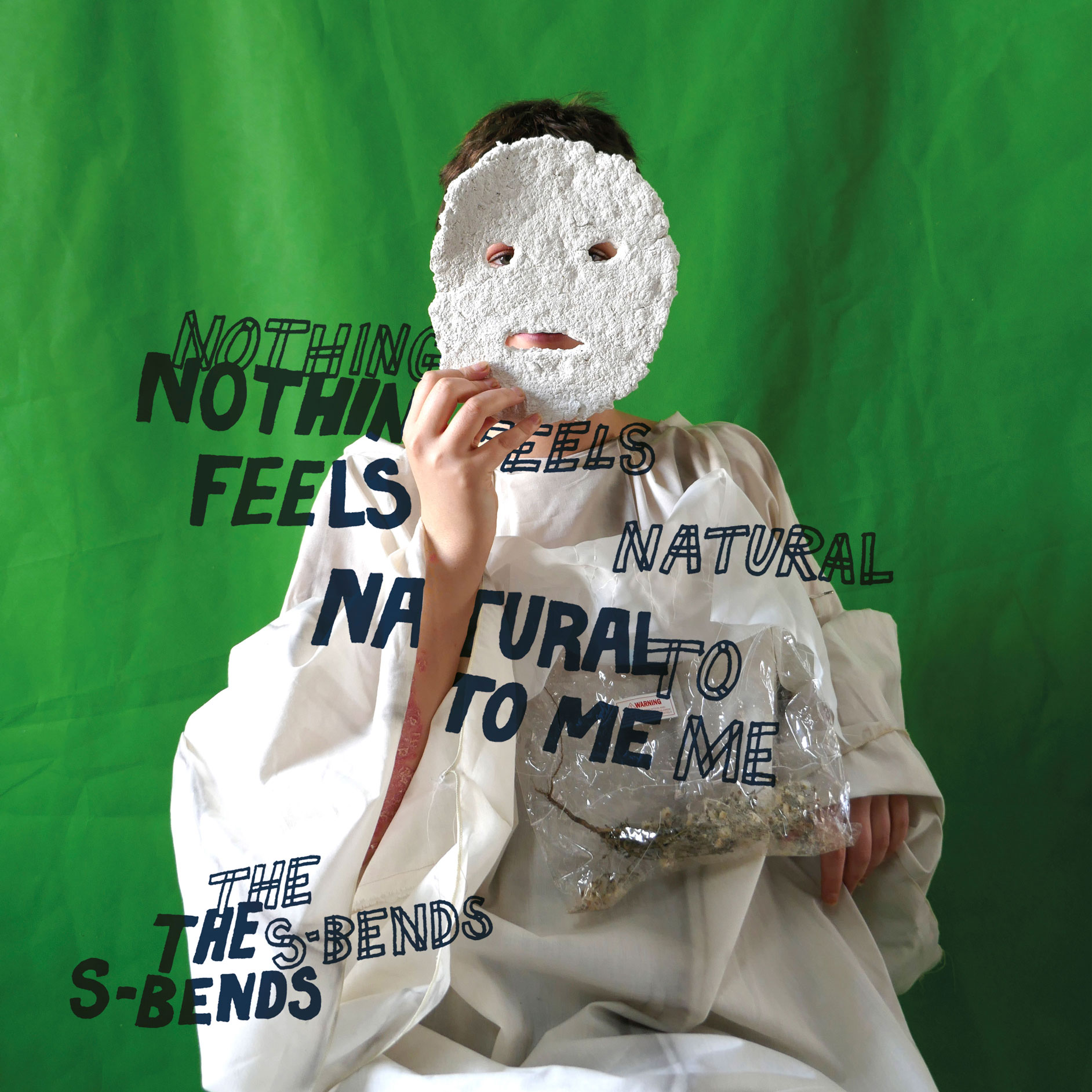
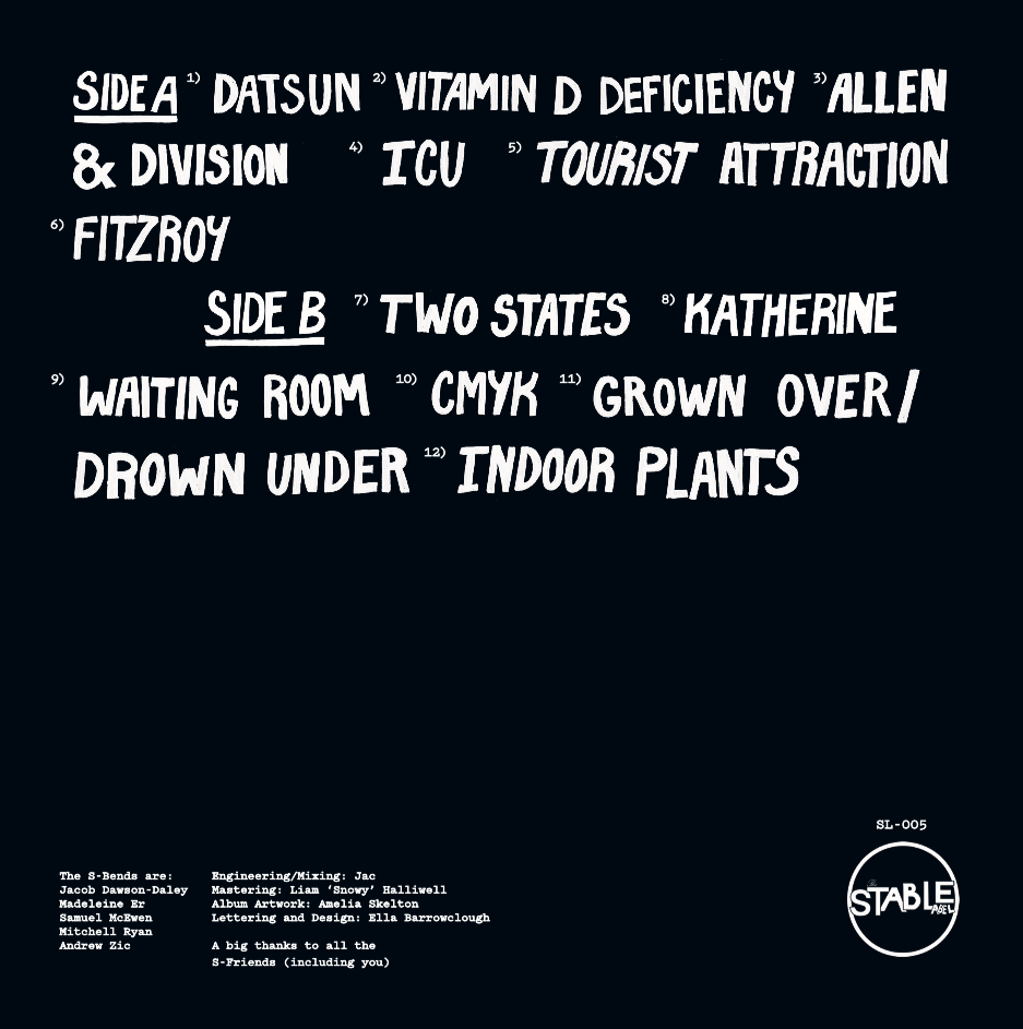
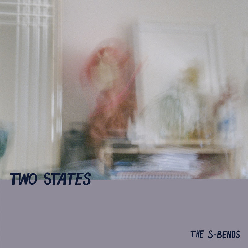
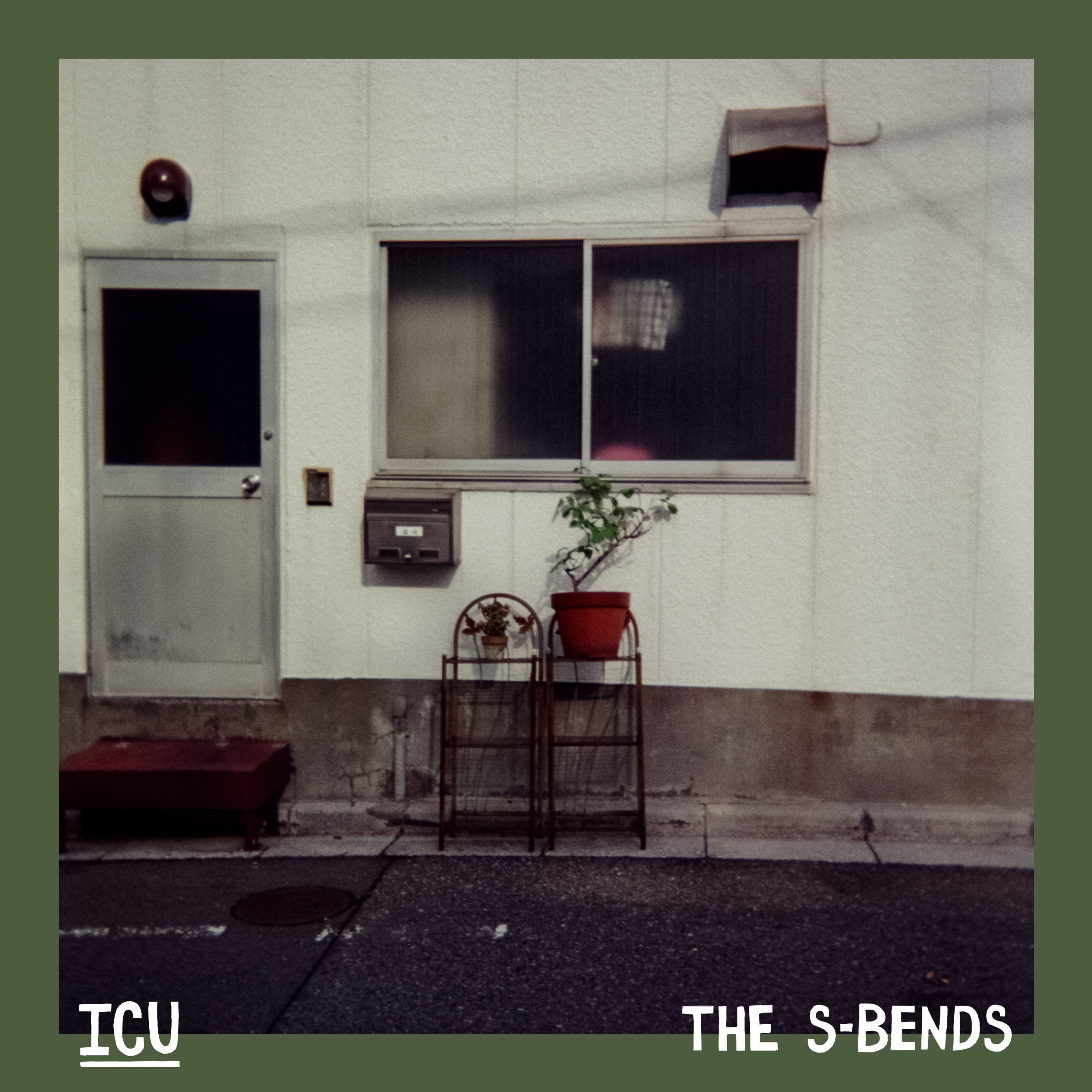
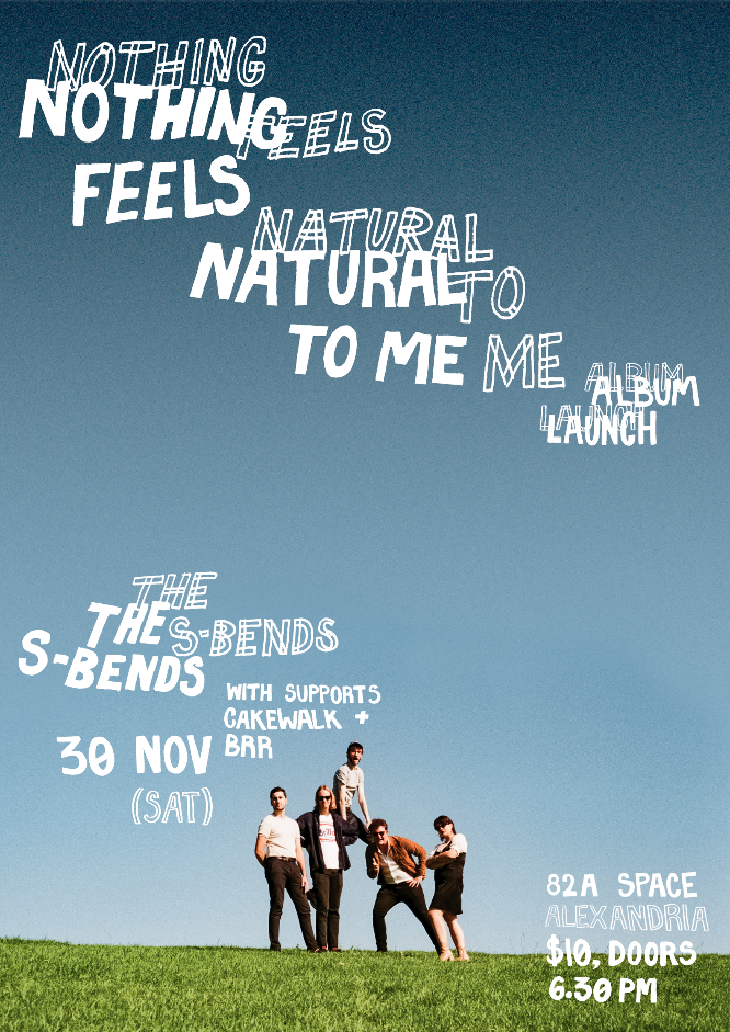
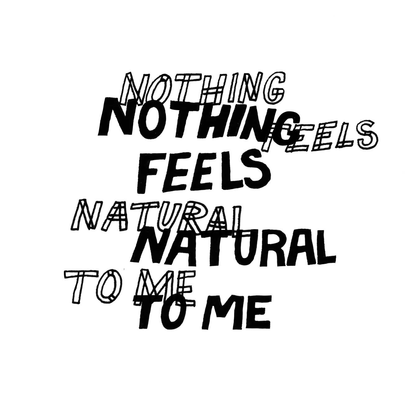
| 2019: The S-Bends Nothing Feels Natural to Me by the S-Bends Album design for vinyl and merchandise for Sydney band: The S-Bends' debut album Nothing Feels Natural to Me. Custom type and layout by me. Also pictured the two singles Two States and ICU both utilising custom type. Artwork by: Mils Skelton | |||||||||||||||||||||||||||||||
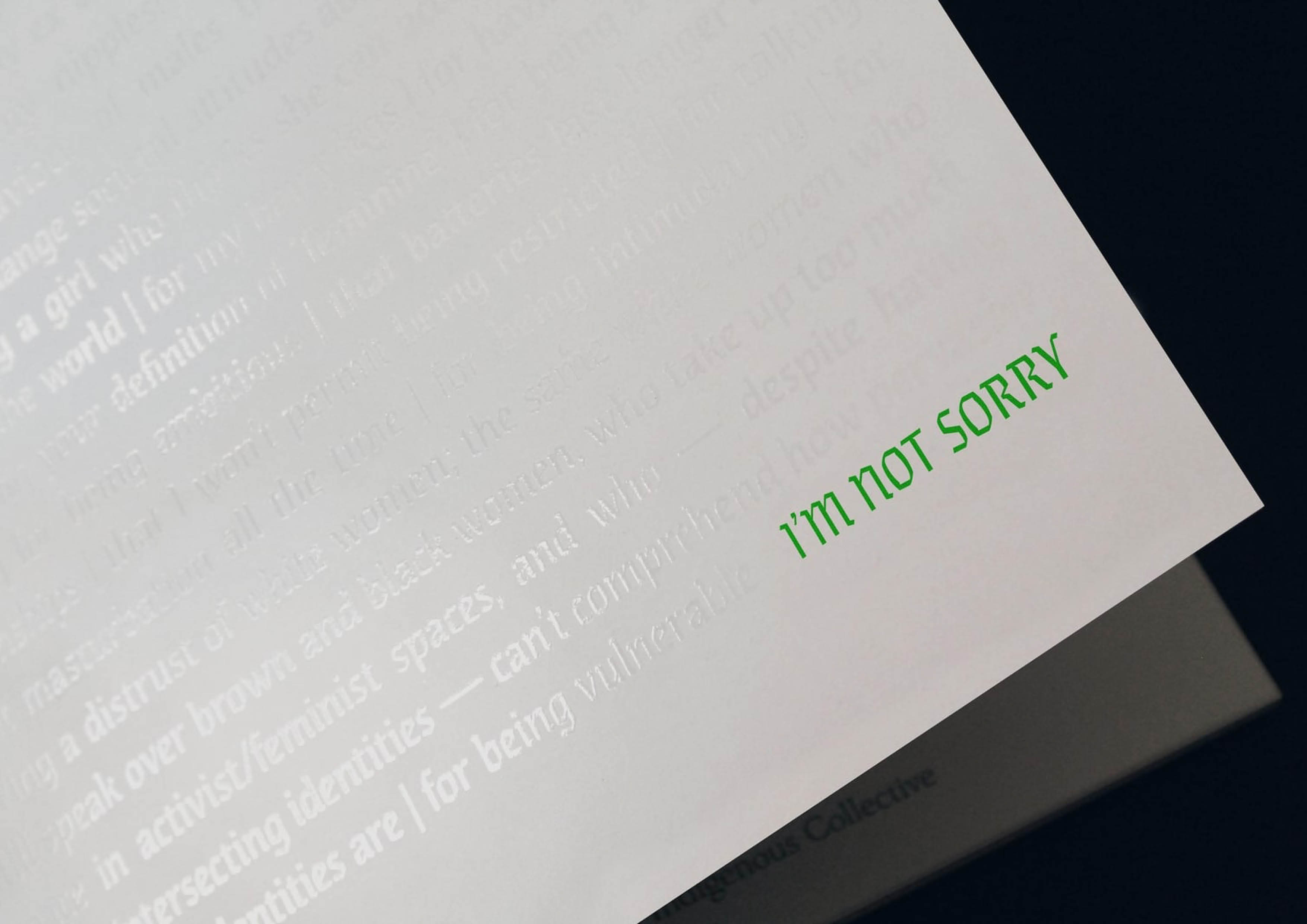
| 2017: I'm Not Sorry I'M NOT SORRY ... the 2017/18 edition of the UTS Women’s Collective magazine. The issue’s theme, I'M NOT SORRY, sought to turn up the volume on the voices being represented, with written, visual and editorial work being made up of work from around 50 women identifying contributors. I worked alongside Isabella Sanasi to develop the issue's design principles, coordinate artistic contributors, produce final layouts, and art direct the vision of the magazine. EDITOR IN CHIEF: Aryan Golanjan CREATIVE TEAM: Ella Cutler, Isabella Sanasi & Leanne Nguyen EDITORS: Bernice Datu, B. T. Burton, Chelsea Hui, Chloe Malmoux-Setz, Georgina Goddard & Susanna Li | |||||||||||||||||||||||||||||||
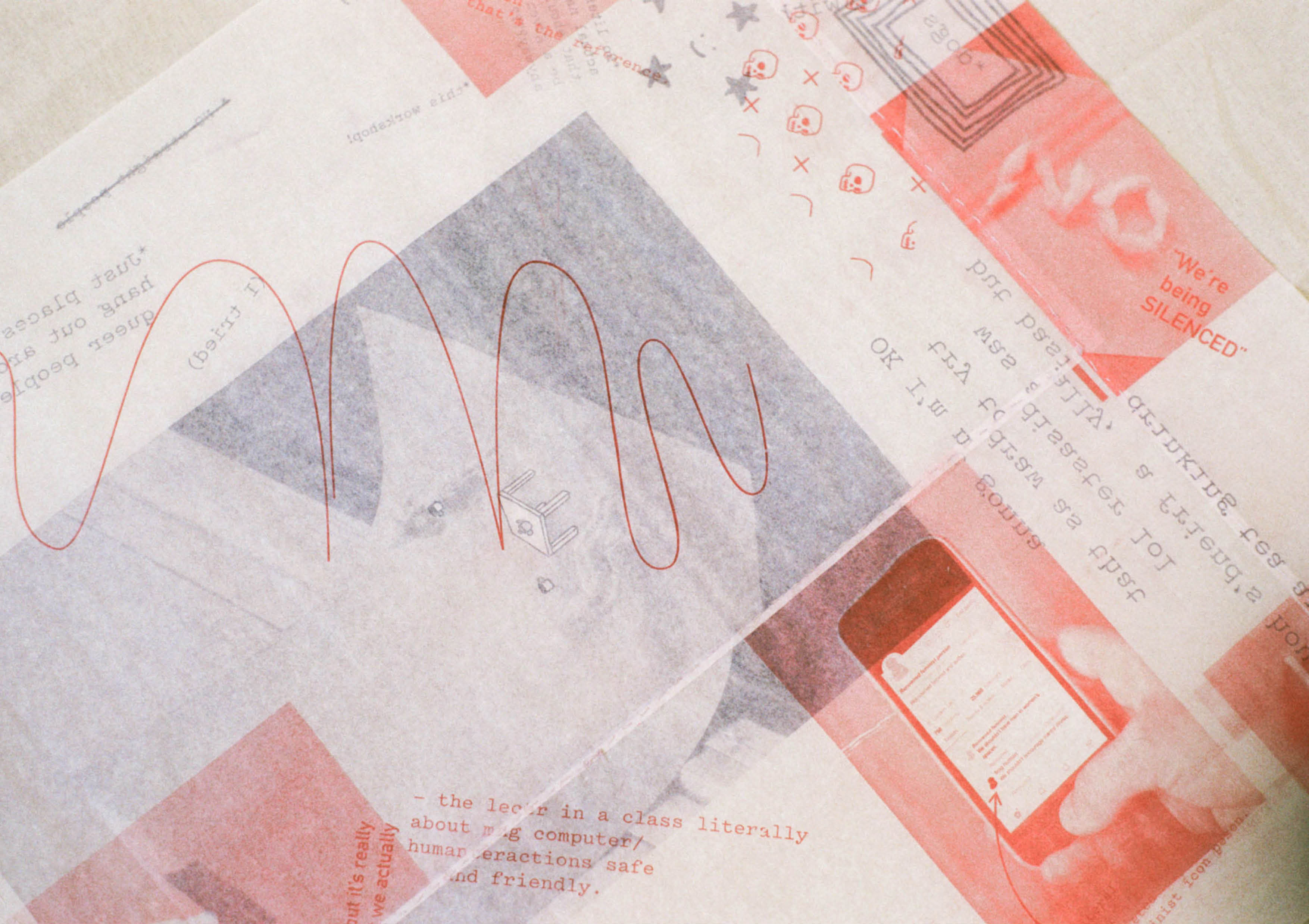
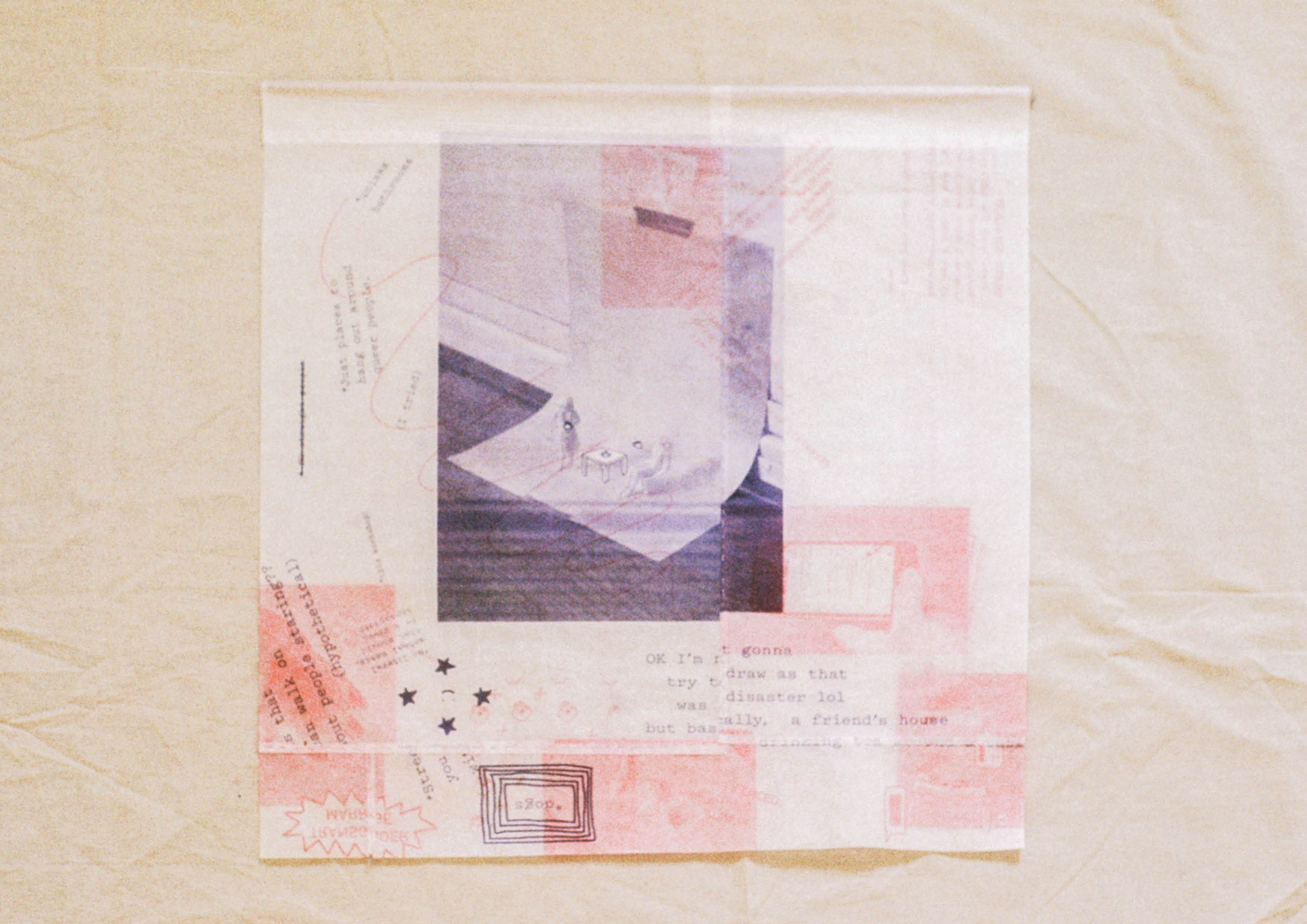
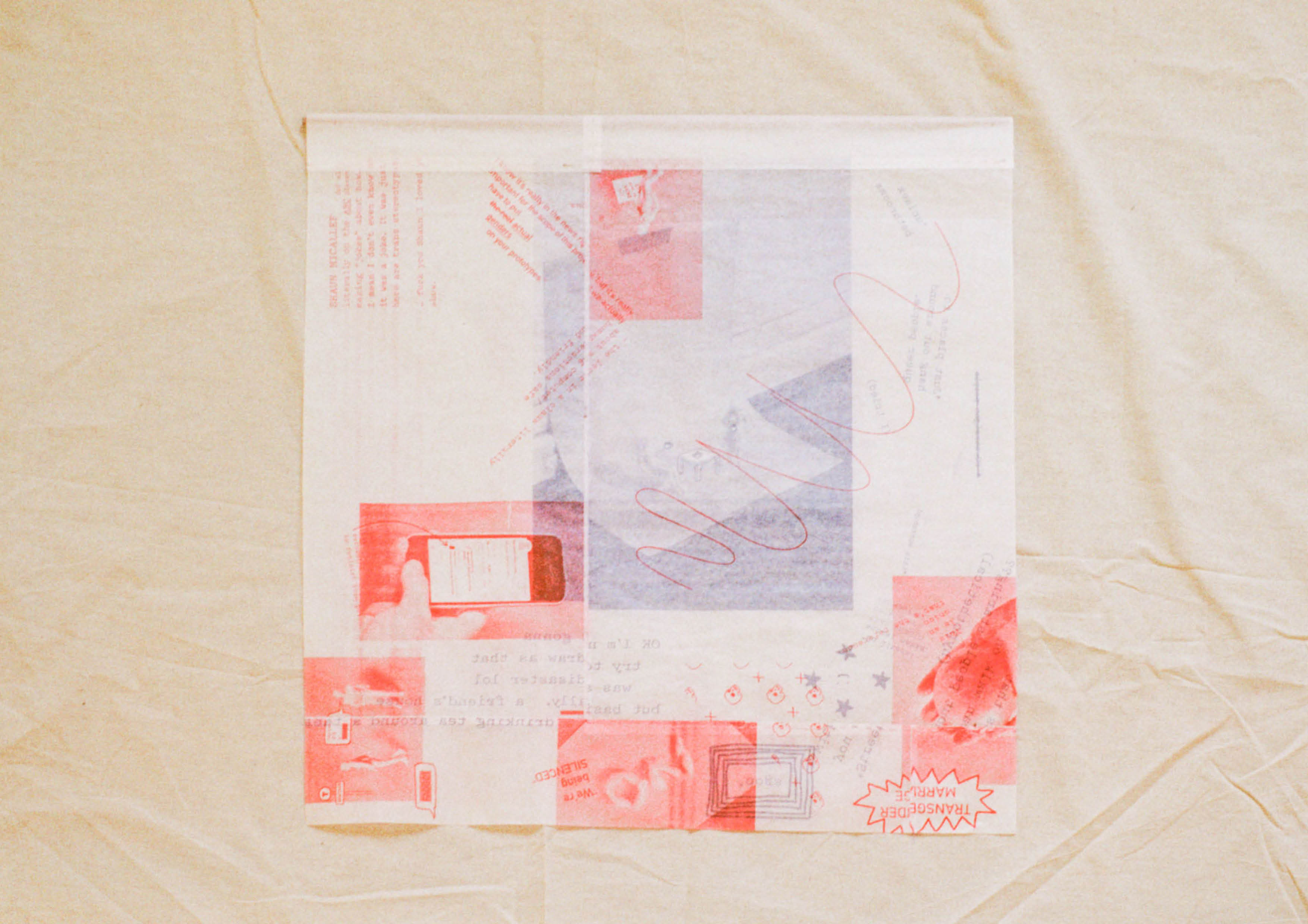
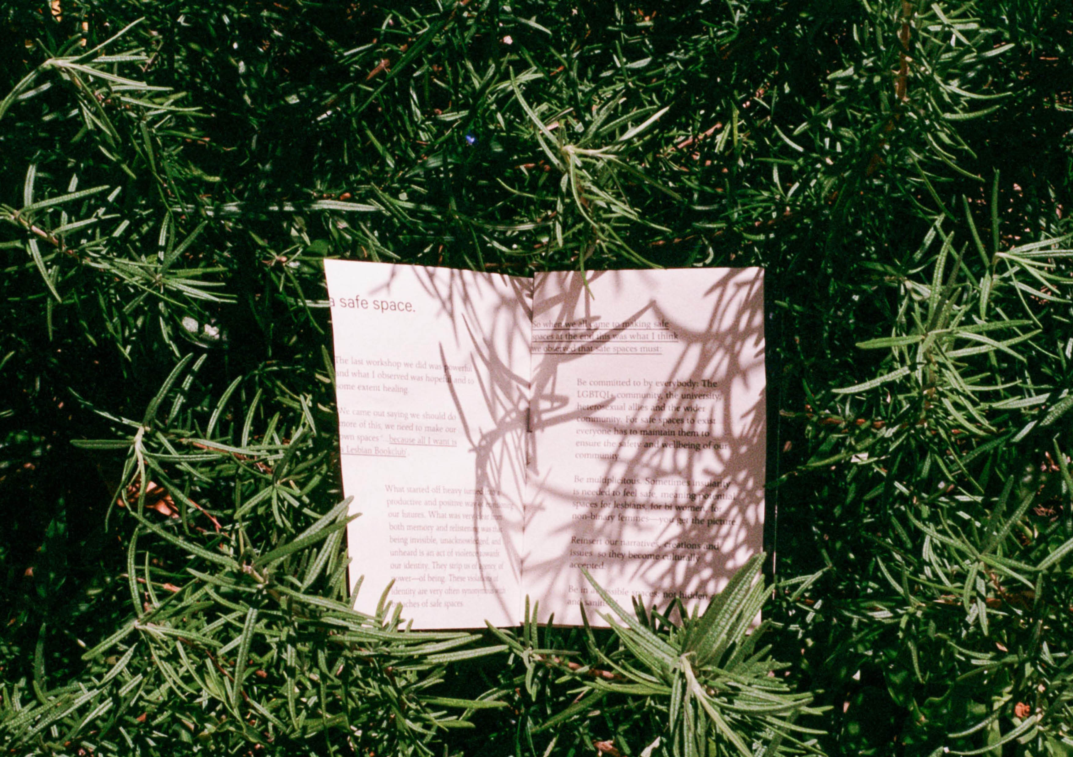
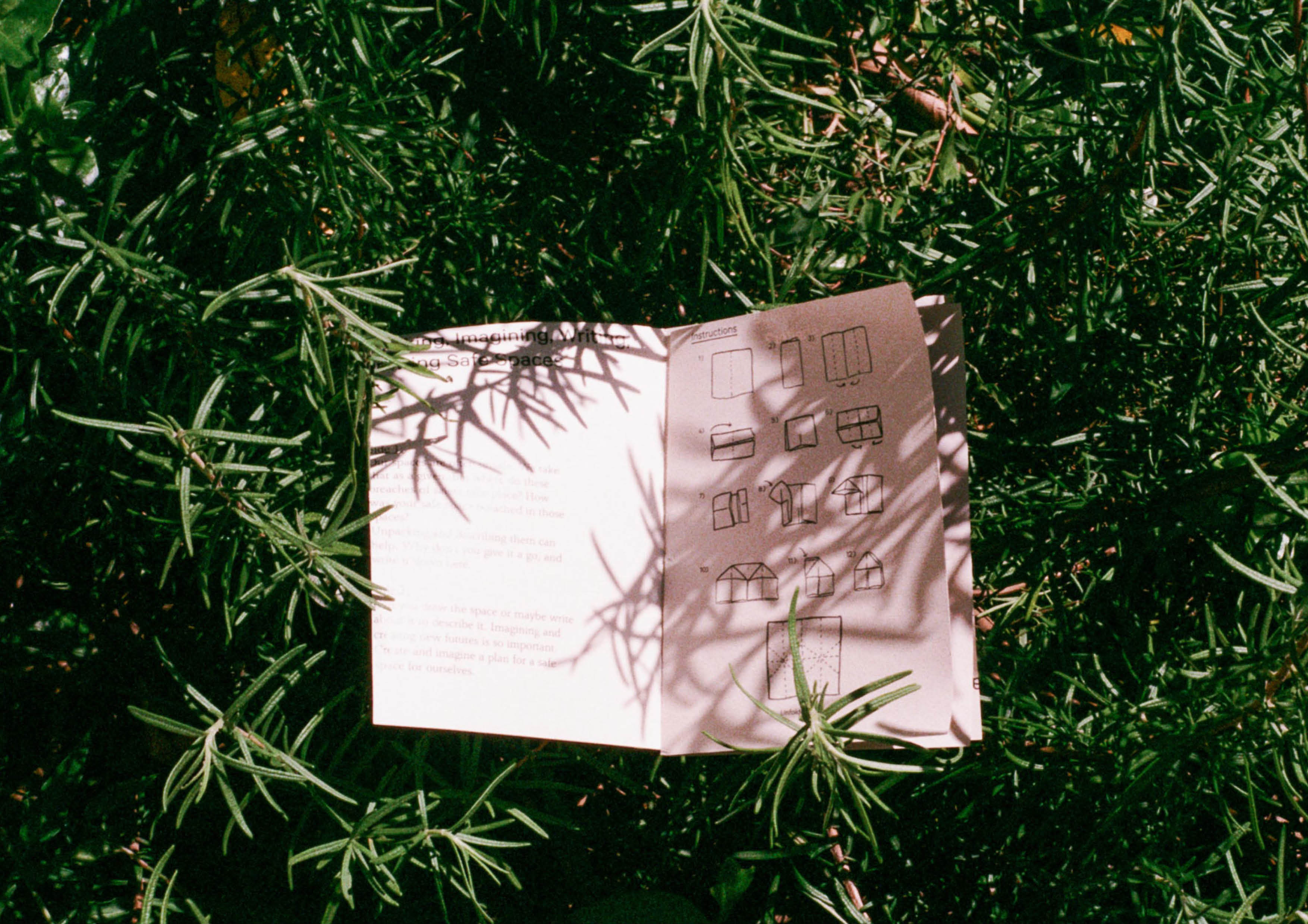
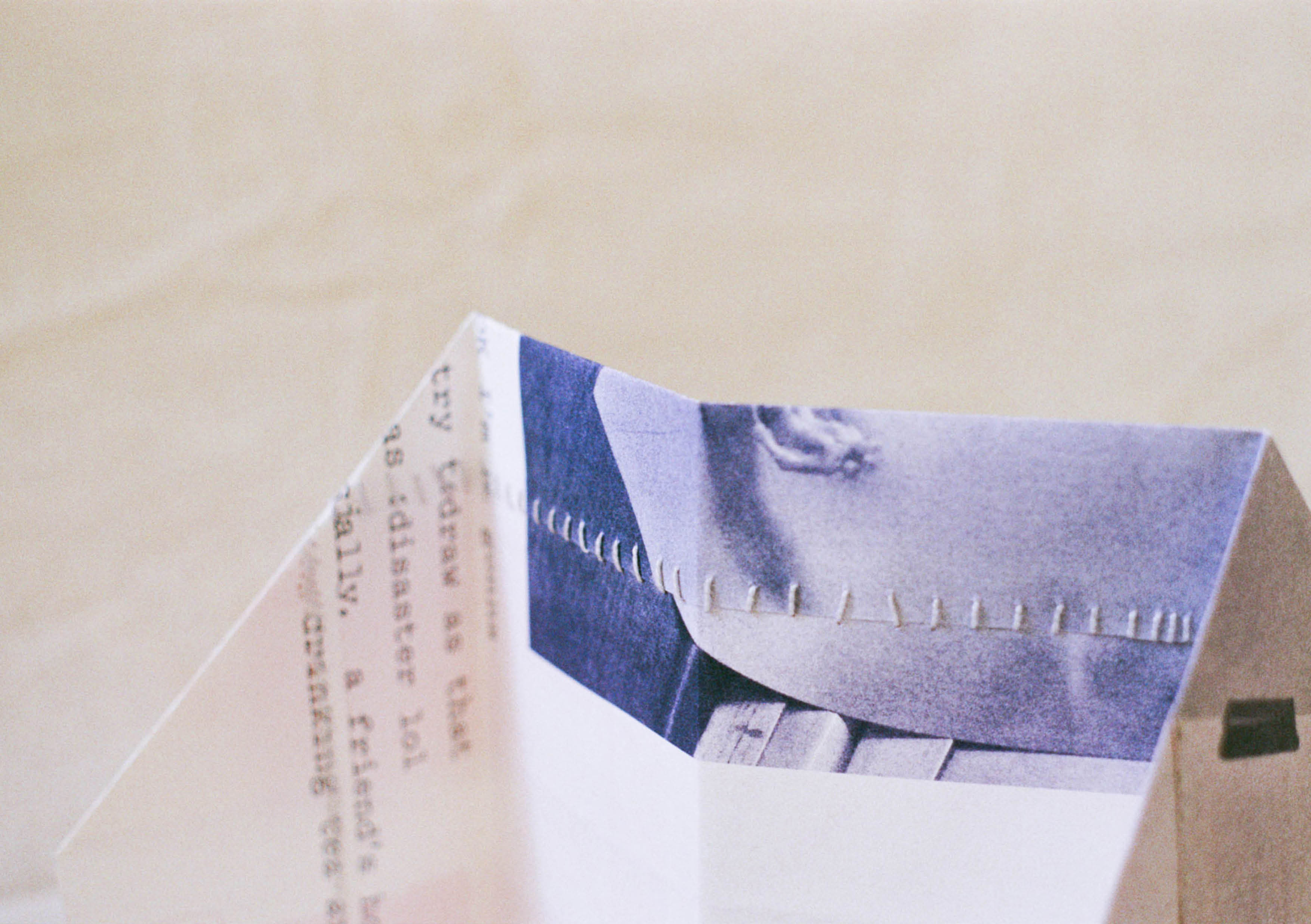
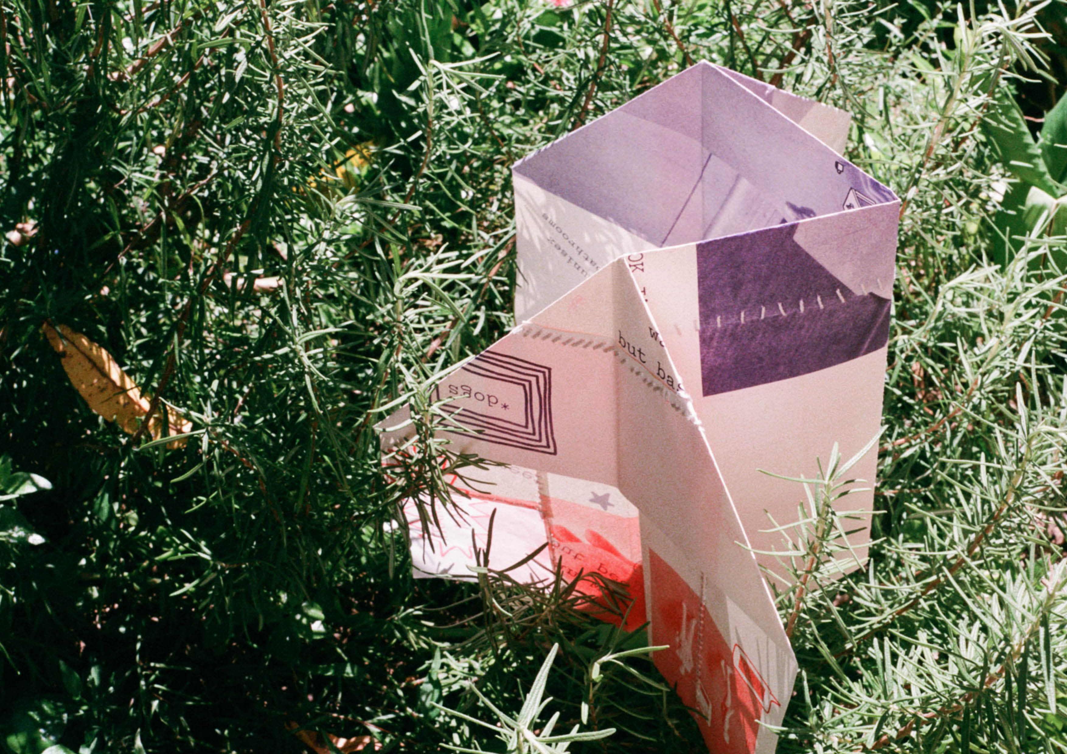
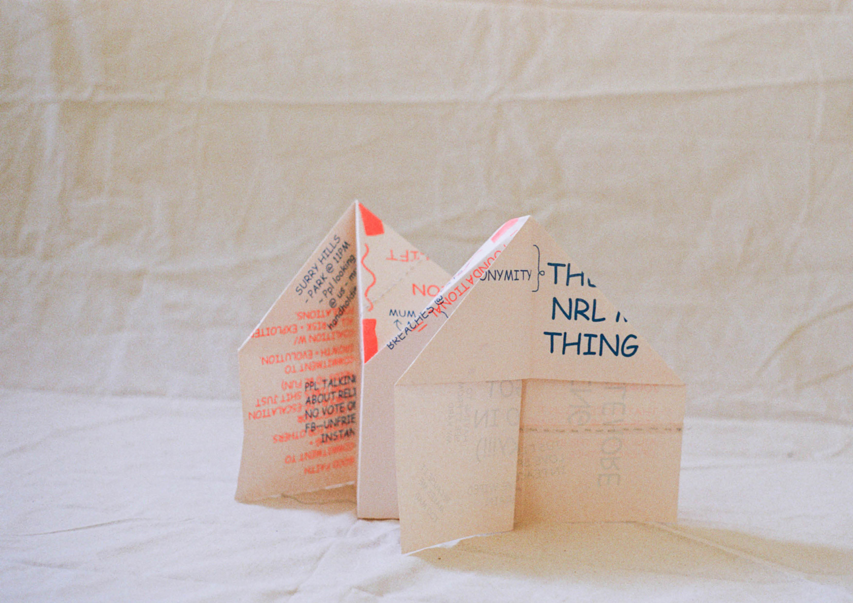
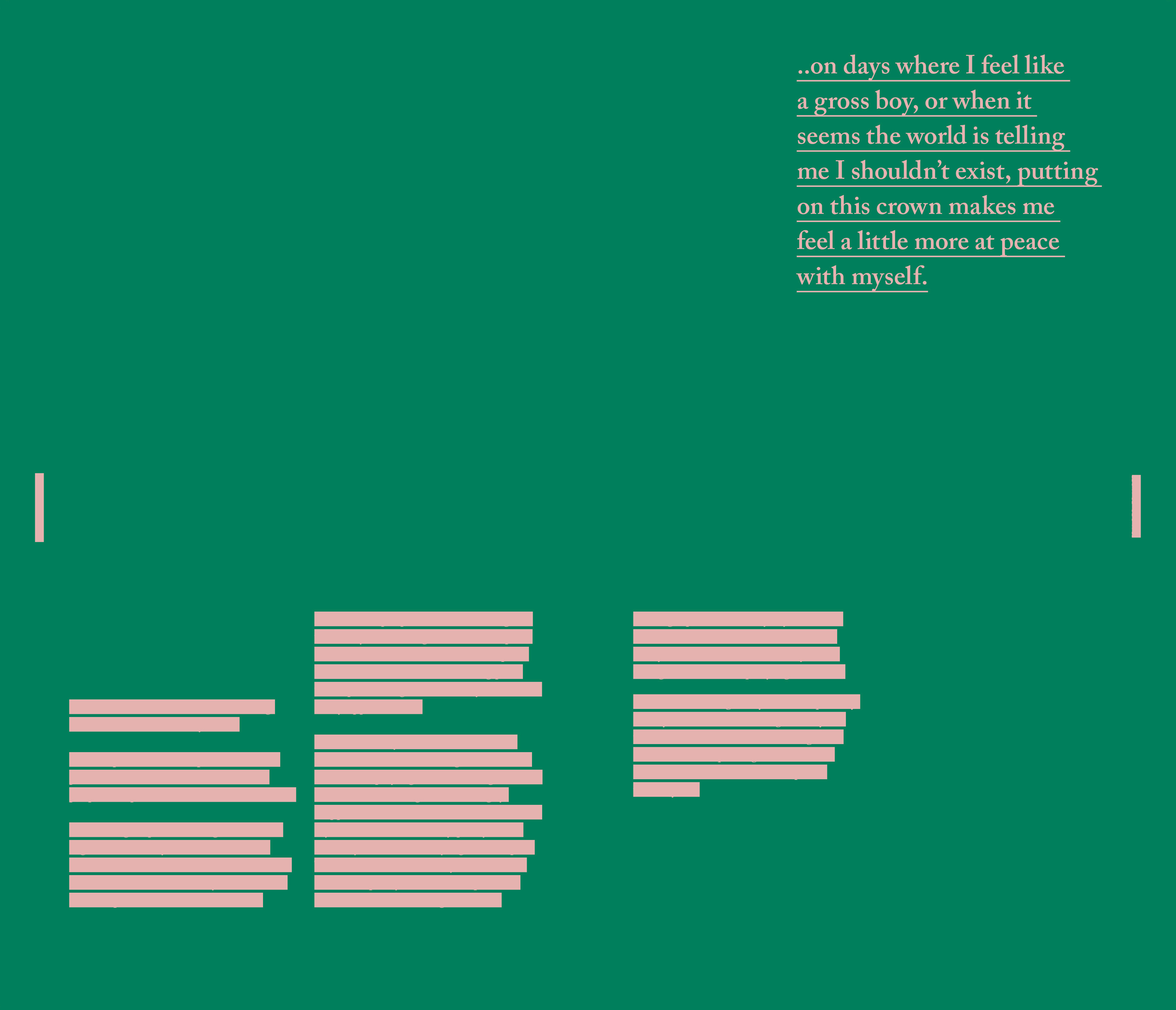
| 2019: Just Spaces Just Spaces Just Spaces, was part of my Masters of Design (Research) at UTS, that explored a Queer methodology for design research. The investigation began with my personal experience as a young Queer woman feeling tired with the constant and daily discrimination towards the LGBTQI+ community that exists within the media, politics, society and everyday interactions between people. It seems that recently there has been an extra amount of news and social media coverage of discriminatory events towards the LGBTQI+ community, for example, the plebiscite on same-sex marriage, which was a particularly tiring event for the community. This experience of tiredness is shared broadly by marginalized communities and identities, which can lead to minority stress and impact the mental and physical health of people. Although an LBPQ identifying person may not experience outright discrimination on a regular basis, they are faced with microaggressions that can take the form of intentional or unintentional comments and actions that question and demean them. Using design practices and methods, the research aims to communicate the effect that microaggressions have on LBPQ identifying people to activate dialogue and instigate change surrounding the creation of safe spaces for this community. In 2017, I facilitated two workshops with a group of anonymous LBPQ identifying people where they were asked to reflect on moments where they felt their sense of safety had been breached and then to imagine and plan new safe spaces for the future, for them and their community. The series of six double-sided risograph prints are visual translations of the stories, anecdotal data and the solutions that the workshop participants offered. Workshop outcomes included the necessity for safe spaces to be: for all (identities and sexualities), accessible, inclusive of narratives so they become culturally accepted, maintained and committed to by everybody, educative, equipped with medical and counseling facilities, and to be everywhere. Photos by Ella Cutler and Kim Phan | |||||||||||||||||||||||||||||||